Industry
Healthcare
Company
Memorial Sloan Kettering Cancer Center
MSK Direct
UX audit
Research
AB Test
Product Strategy Support
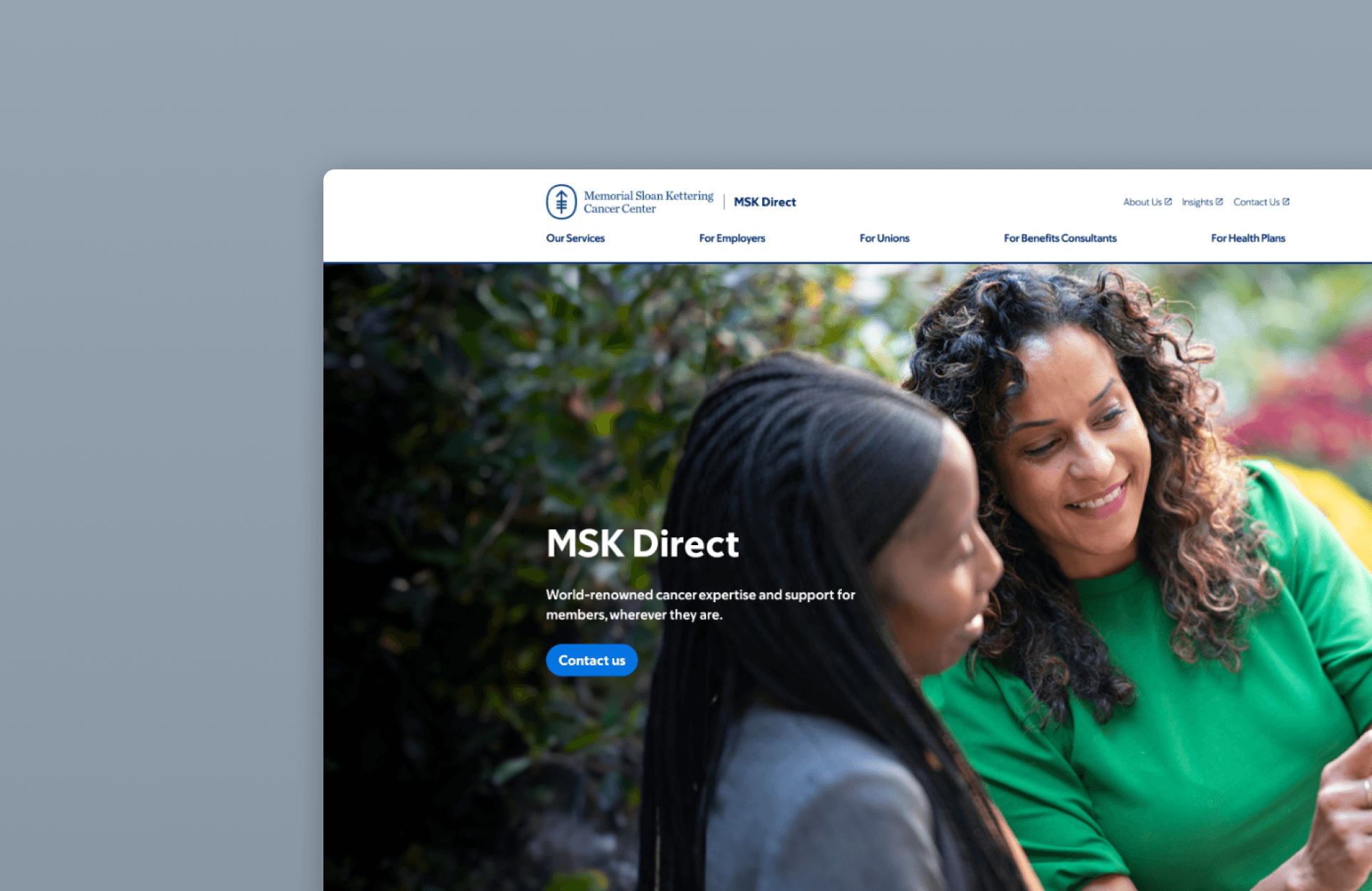
About MSK Direct
MSK Direct is a national cancer benefits solution that provides more than 5.5 million employees, union members, and their families with equitable, personalized access to the lifesaving discoveries and subspecialized expertise of Memorial Sloan Kettering Cancer Center (MSK).
Responsibility
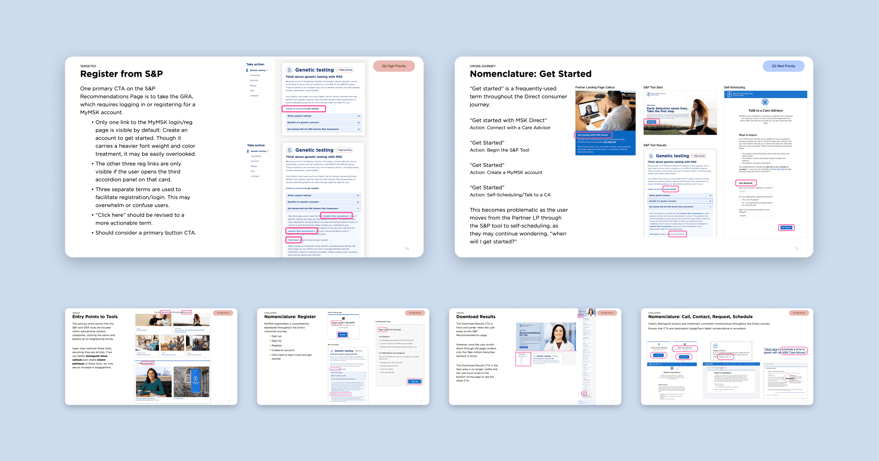
In 2022, collaborate closely with UX research lead and stakeholders, I conducted UX audit and heuristic evaluation on MSK Direct user journey, identified inconsistancies of branding and usability issue, provided support on strategy approach and prioritizations.
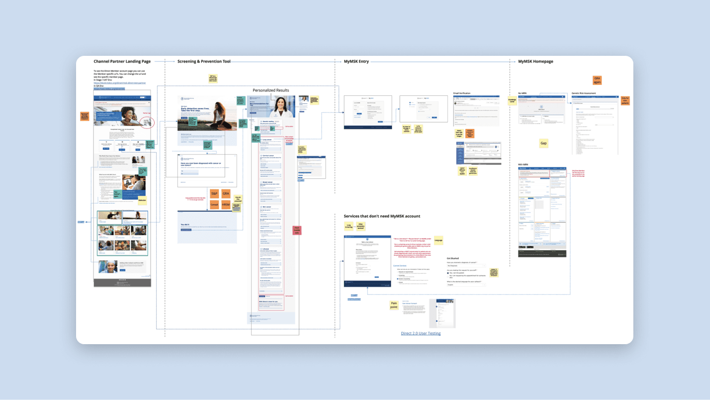
Detailed member journey, pain points
Detailed member journey, pain points
Heuristic Evaluation Highlight
Key Insights
User pain point 1
Value of signing up for MyMSK is not effectively communicated, while we advertise it everywhere in the journey, causing confusion about what MSK Direct actually offers, and members feel they are going in circles
User pain point 2
When user proceed with steps after taking questionnaires or signing up, user expects more targeted service or content, but some of our content don’t support that level of personalization.
Stakeholder insight 1
S&P tool benefits from that it’s simple and accessible. Users need to take the online test with a certain frequency to reflect any lifestyle change or information update.
Challenge & Further Research
User pain point 2 and stakeholder insight 1 seemingly lead to conflicting solution - while pain point 2 supports storing user info and minimize repetitive experience, stakeholder insight 1 suggests that we don't need to store user info at this step. Further research needed to figure out if MSK should build a database to store user’s online test result at this step with or without signup for account.
Goal Reframe
Old question
How do we eliminate the repetitive experience?
New question
How do we manage members’ expectation of personalized support at this step?
We need to test out user’s intention of saving their information at this step - is it a real need or we are just making it up?
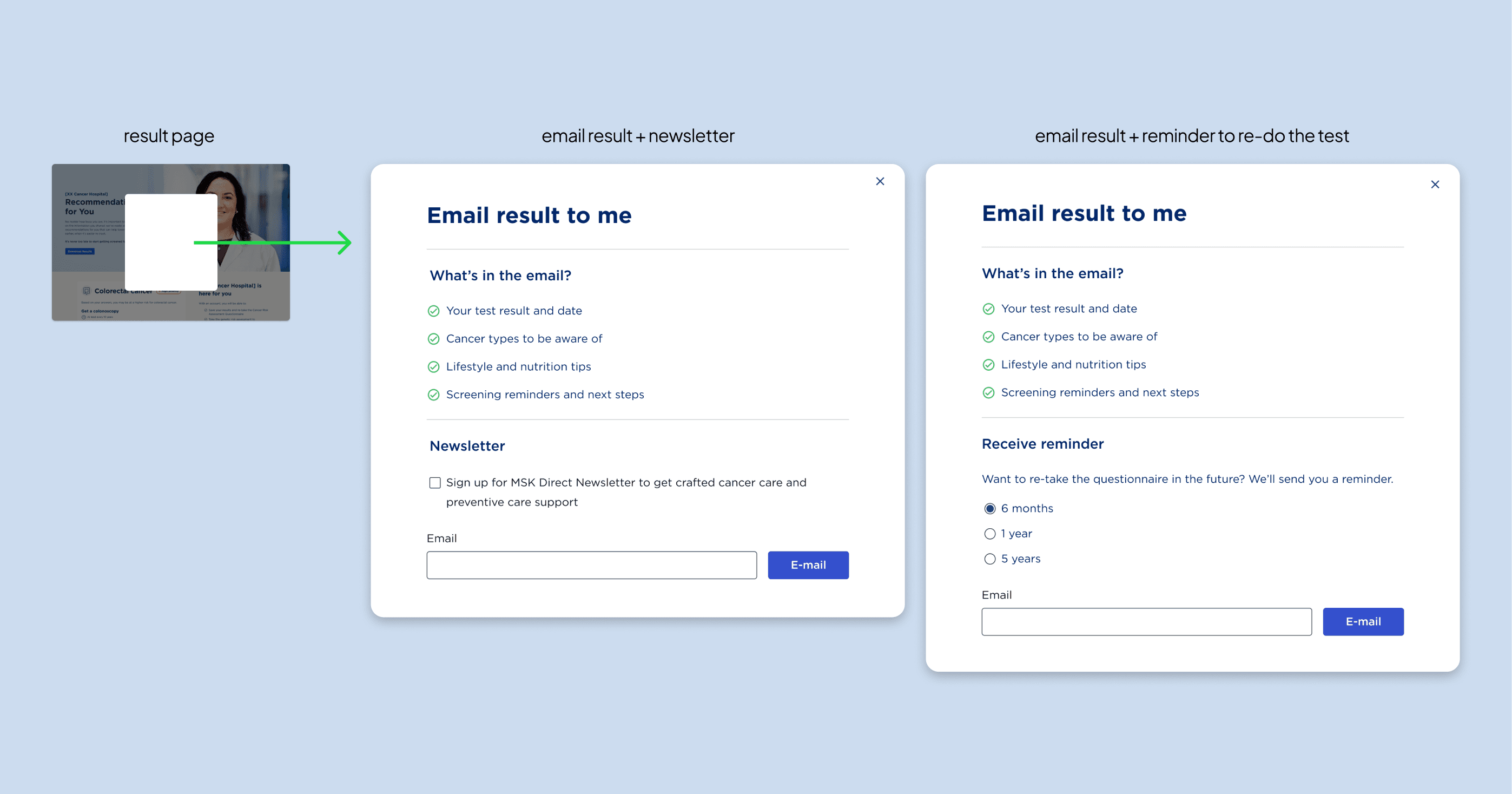
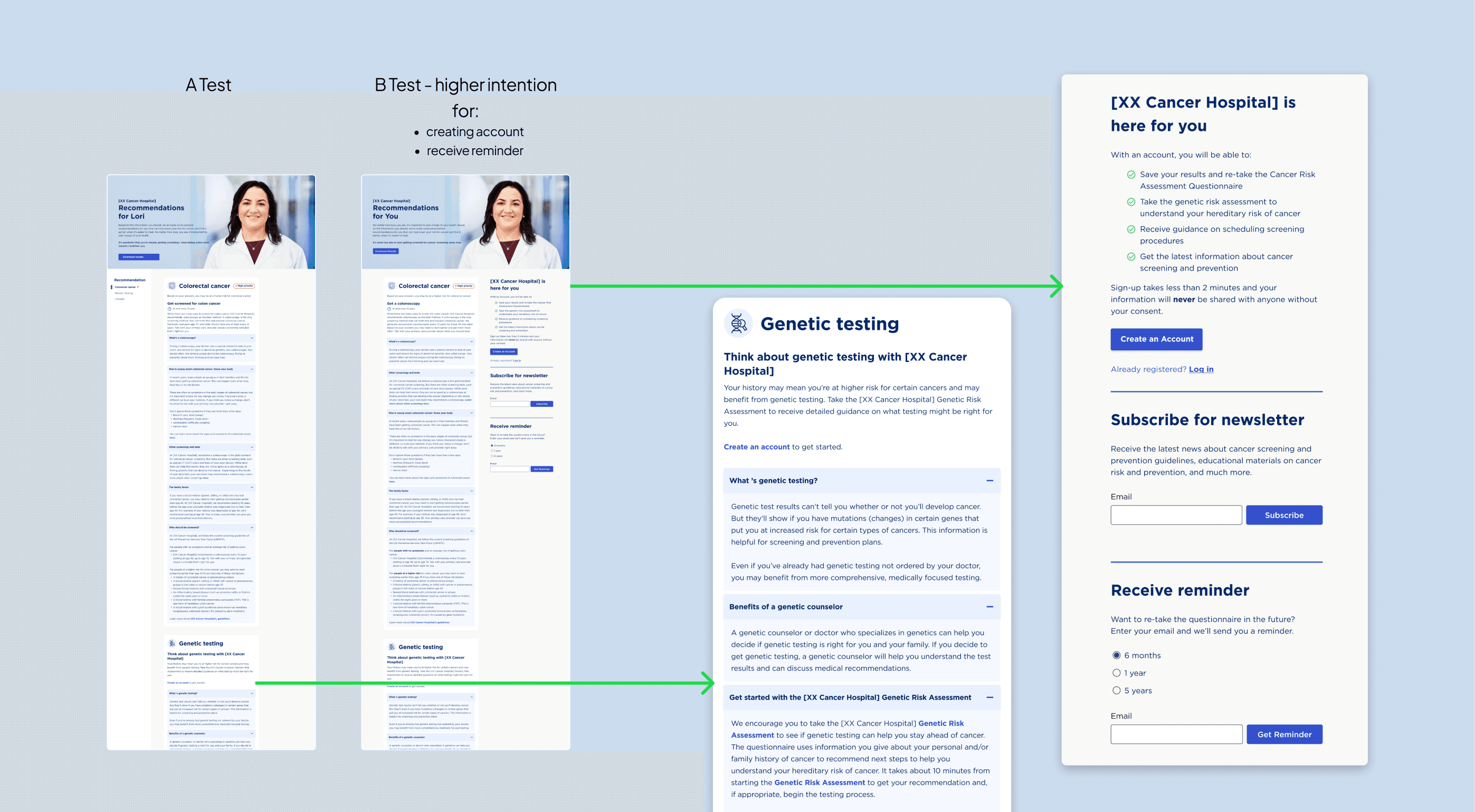
Quick Conceptualization for User Test
I explored:
The minimum level of personalization without signing up for account
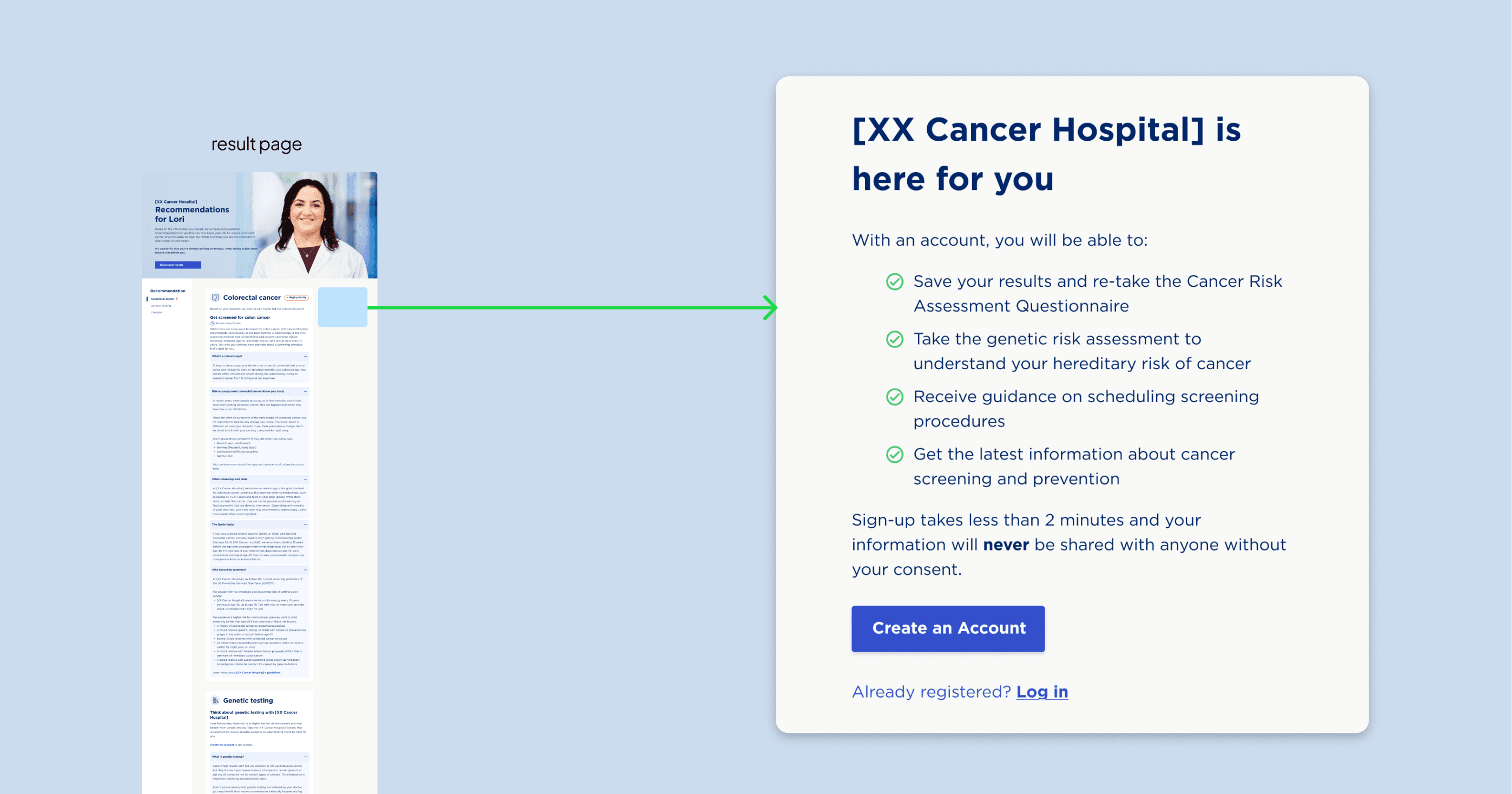
Making current signing-up CTA more engaging by clearly communicating value
User Test & Outcome
We AB tested user's intention and acceptance level of above CTAs, and saw a significant increase in signing up for a MyMSK account with the effective redesign, and high acceptance rate to receive reminder to re-do the test in near future.
With the audit report and user test findings, we are able to provide support to further assist the design of MSK Direct.
