Industry
Healthcare
Company
Memorial Sloan Kettering Cancer Center
MyMSK
1-Scale
Patient Portal
Web App
Desktop and Mobile
End-to-end
Design System Support
Responsibility
To support patients and caregivers, MSK(Memorial Sloan Kettering Cancer Center) offers access to a patient portal, MyMSK.
From Aug 2021 to Jan 2023, I designed and supported MyMSK product team on multiple features at the MyMSK patient portal, including:
Lab results search and browse experience
Multi-language experience
Patient and caregiver accessibility to their health records (Continuity of Care Document x CUREs Act)
This page showcases the design process behind the Lab Results feature. If you're interested in a comprehensive overview of MyMSK, I'd be glad to walk you through more details in an interview.
My research and design journey
Background
Users encounter unintuitive experience looking for lab test results updates and past results, resulting in frustration and increased helpdesk tickets.
Product team plans to address a major backend issue that currently prevents users from accessing their complete historical lab test data.
Objective
Leverage this backend improvement to deliver a seamless and intuitive user interface.
The redesigned experience should facilitate easy access to and navigation of past lab results
Enhanced search and filtering capabilities to support users in quickly finding specific tests and results.
Old Lab Result Interface
Qualitative Research
Working with the UX research expert in the design team, I conducted series of click tests and surveys with 14 members from PFACQ - the patient community of Memorial Sloan Kettering Cancer Center.
We set up 2 common scenarios, each with a click task followed by a survey, and open questions.
We asked users:
What are the scenarios when you look for lab results?
What information is important to you during search?
Have you experienced difficulty finding these info?
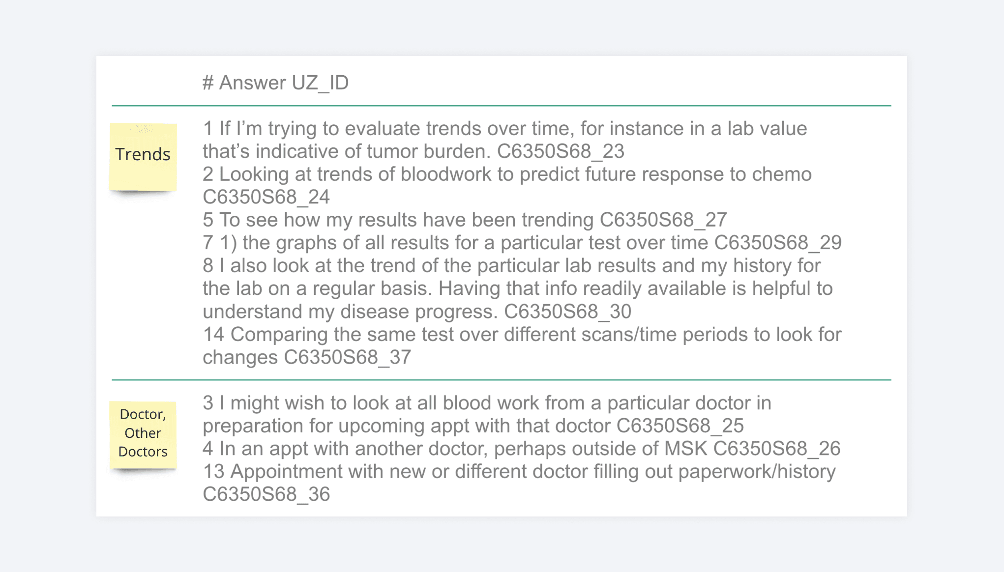
The feedback received provided valuable insights into user behavior, and we learned that the majority of users access the lab result section to:
Obtain Updates
Prepare for Doctor Visits
View Trends
When seeking updates, users prioritize information related to:
Test Date
Lab Order Name
Results
When preparing for doctor visits, users prioritize information related to
Test Date
Result
Clinician's Name
Click test
Hypothesis, Insights and UX Strategy
Set up an interview with Xumeng to learn more about the design discovery process of this project.
Design Details
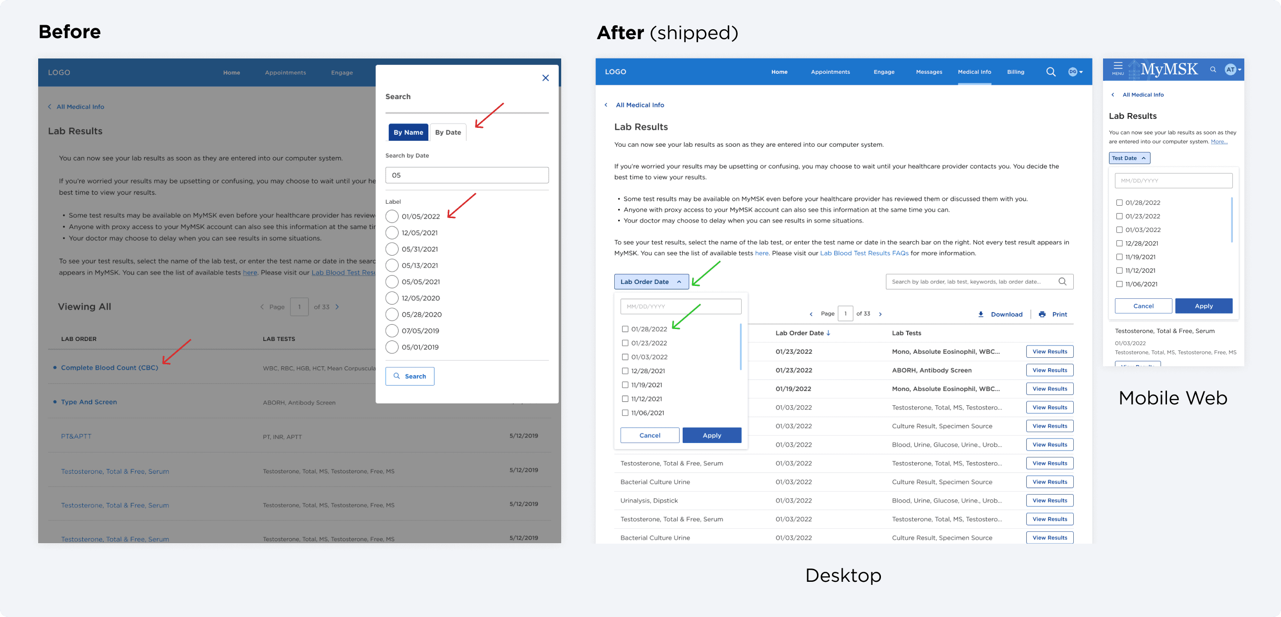
Searching by date(s). Left - old interface. Right - desktop and mobile web demonstrations of new designs.
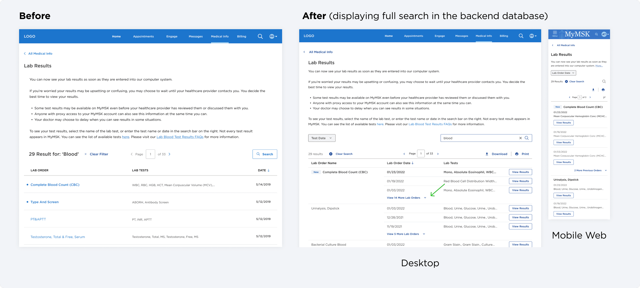
Search by keywords.
Access to history tests during keyword searching.
With the new design, user can also easily access history tests in lab order detail page.
Thinking Ahead
This filter pattern can be applied to other parts of MyMSK, so I also presented these concepts to the product team.
Working with Design System
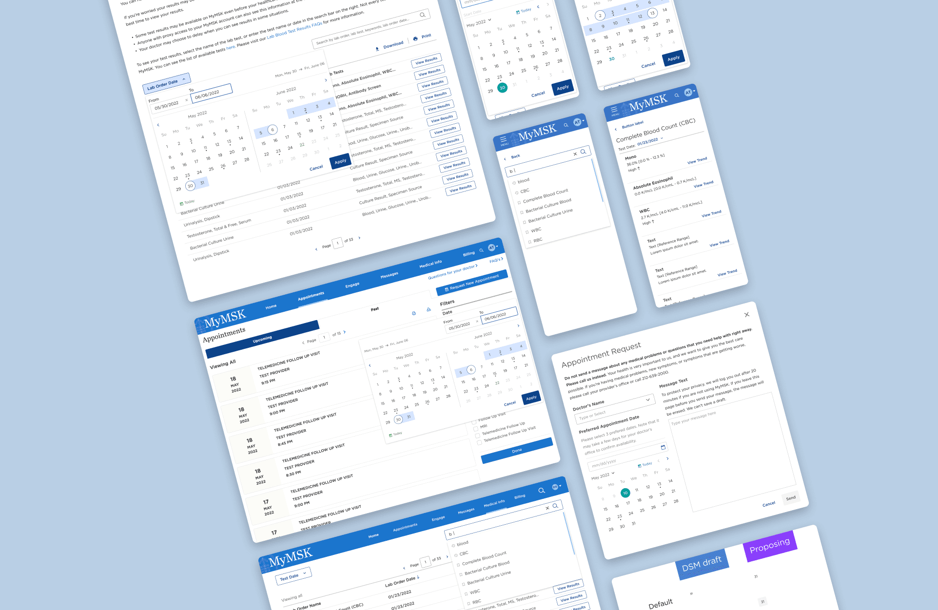
I also started to work with evolving DSM team on a date picker solution that can be used in different places in MyMSK: making appointments, filtering past appointments, medical documents and test results.
Outcome
Helpdesk tickets about not able to find historical tests significantly decrease
Reduced time spent searching for specific lab results.
I socialized the date picker idea across teams, added it to the roadmap for design system
Sample of Design Specs
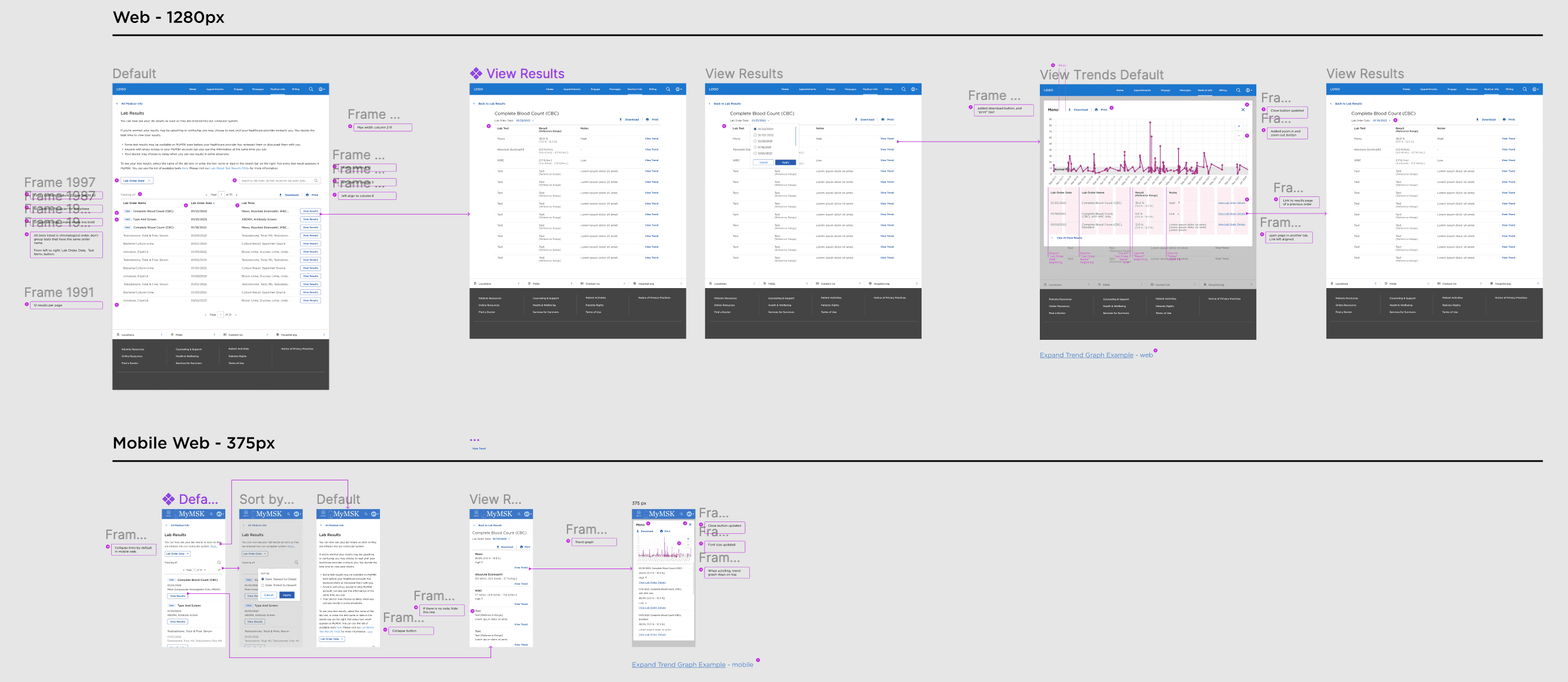
Here are some samples of the engineering spec and design QA spec I delivered to the devs on the team.
Engineering spec sample.
Design QA - default view.
Design QA - filter by date.
Go Beyond the Obvious
Below are some examples of designs that we didn't end up using for all sorts of reasons - they can be too complex, too hidden, too distracting, or can’t be implemented due to tech constraints.
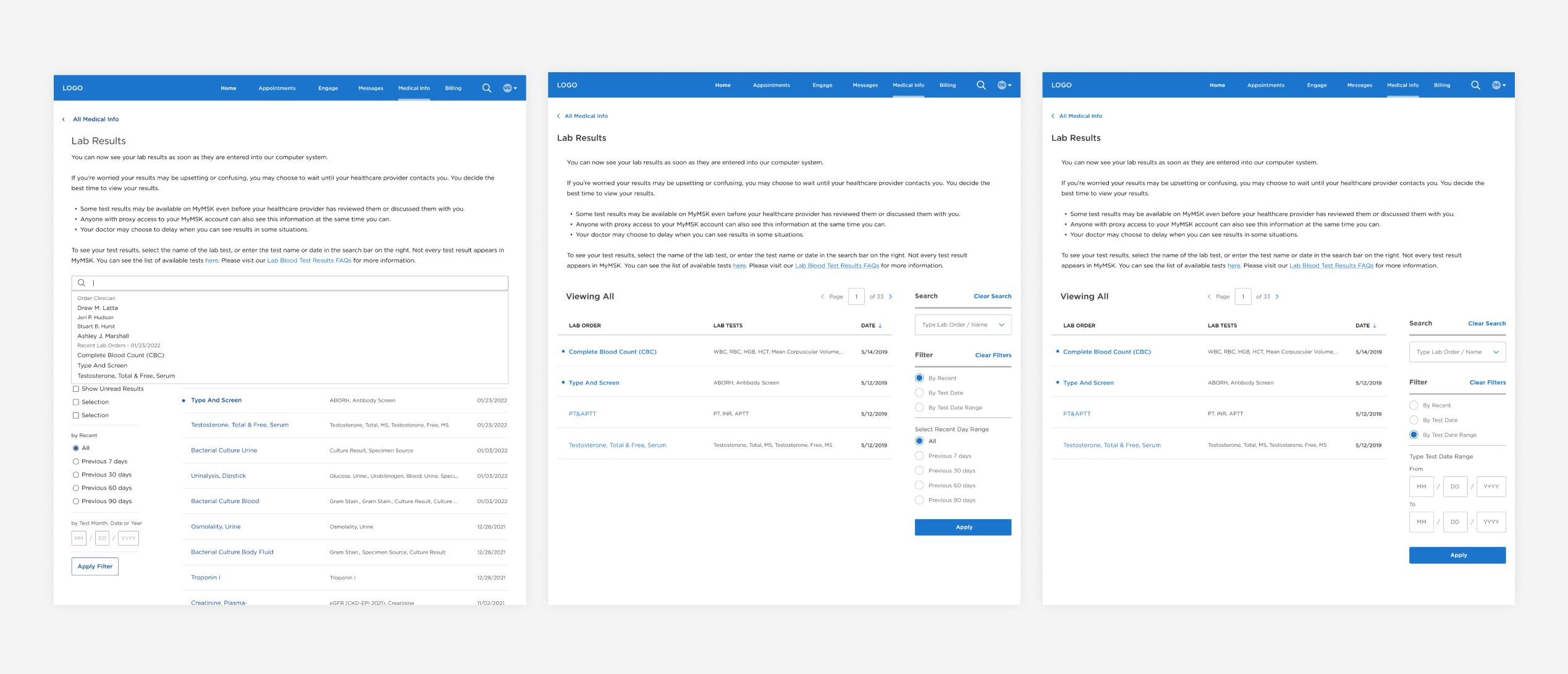
Search and filter ideation - universal search & side bar filter.
Search and filter ideation - universal search & side bar filter.
Thank you for taking the time to read about the Lab Result work I did for MyMSK. As I mentioned earlier, from Jan 2022 to Jan 2023, I also supported MyMSK product team on two other features at the MyMSK patient portal:
Multi-language experience
Patient and caregiver accessibility to their health records (Continuity of Care Document x CUREs Act)
If you are interested, I’m happy to show you more details in a virtual / in-person meetup:)
