Industry
SaaS / Digital Marketing
Company
SAP
SAP Microsites
0-1
Redesign
UX Strategy
Design System Support
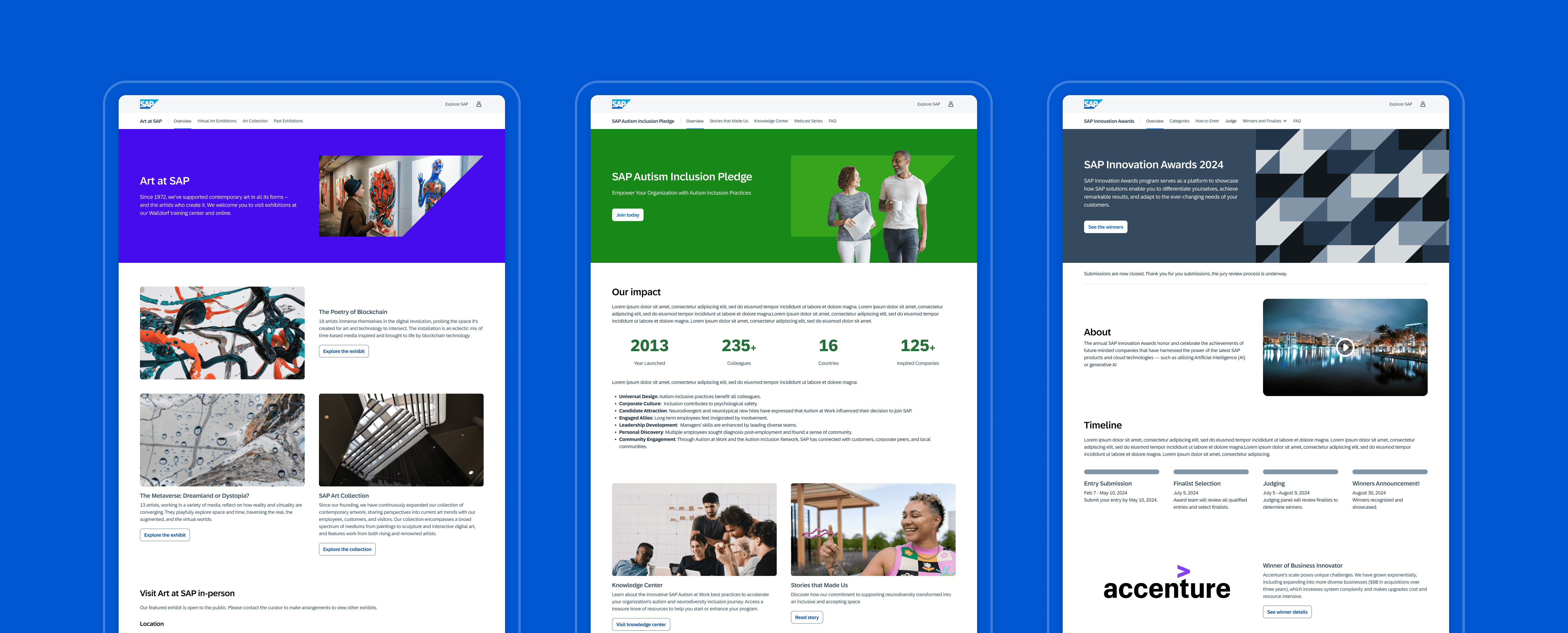
Three SAP microsites using same template - Art at SAP, SAP Autism Inclusion Pledge, SAP Innovation Awards
About SAP Microsite
An SAP Microsite is a small, temporary, and discrete Web presence designed to raise awareness among a unique audience on a topic that aligns with the corporate mission but does not fit within a core Web property. The primary goal of these microsites is to drive traffic to SAP.com and other key SAP web properties.
This initiative aims to develop a framework within SAP.com in support of landscape simplification, ensuring that the digital ecosystem remains focused and effective, while enabling a seamless, cost-effective, fully compliant omnichannel customer experience.
My Role and Contributions
Performed UX audits and usability research to identify areas for improvement.
Worked with Adobe Experience Manager (AEM) and the evolving SAP Digital Design System to enhance and standardize website templates. Created and delivered UX designs and provided practical UX guidance.
Support the launch of a pilot website, Art at SAP, during a major company visual identity rebrand - Project Glow 2024.
UX audit of SAP’s microsites from past 10 years
Research Process
The research process included a UX audit, a competitor study, and an exploration of non-competitor inspirations. I also referred to guidance and research articles from the Baymard Institute for existing insights and collaborated with analysts to examine data insights. To gain a user perspective, I conducted a UX audit of a selected collection of SAP's past microsites. The findings, including a heuristic evaluation and usability audit, were then presented to the steering committee.
Audit report
Audit Report Highlight
Home page not strategically structured, no storytelling.
Unclear CTA language and CTA doesn’t serve purpose of site.
Repetitive usage of limited components for different types of information
Too many unneccessary linkage causing user to go in circles before accessing valuable content
UX Strategy
To ensure a smooth content consumption flow, the proposed UX solution includes:
Clearly defining the focus of storytelling, identifying where the audience can take time to digest content, and determining the best places to provide grouped content for easy scanning and decision-making.
Limiting unnecessary links to avoid information overload and maintaining a clear focus on key messages.
Matching content types with appropriate visual components to reduce cognitive load, and creating consistent interactions and expectations for users when they click on something.
Microsite floorplans. A home page floorplan and a child page floorplan with required and optional sections.
Mid-fi floorplan filled with available AEM components.
Streamlining Microsite Design and Development
As a UX designer, it's crucial to ensure that the same UX principles are understood across teams to facilitate future microsite development. For the product team, I also:
Socialized the floor plans, UX strategy, and the intersection of UX and content strategy solutions. This involves documenting and promoting the understanding and importance of storytelling.
Provided clear UX and editorial guidance, demonstrating best practices for using components in AEM for UX designers and web managers who will be using the microsite templates.
Anticipated future needs by creating examples and variations for different use cases. This will serve as guidance and help with the understanding and visioning of future microsites.
Component variations, UX and editorial guidance for alignment and documentation
To demonstrate the full potential of the microsite template, I anticipated future needs and created examples and variations for different use cases that might be part of future SAP microsites. Despite being limited by the available components in AEM, the template still offers enough flexibility to accommodate envisioned microsite content.
Examples and variations for different use cases
Design Team Collaborations
I collaborated with designers in the Way-finding Pod to develop the best solution for the masthead and secondary navigation system for micro-sites. Additionally, I aligned with the SAP Digital Design System team to evolve hero designs both in the short term and long term.
Hero combination guidance
Microsite Pilot - Art at SAP
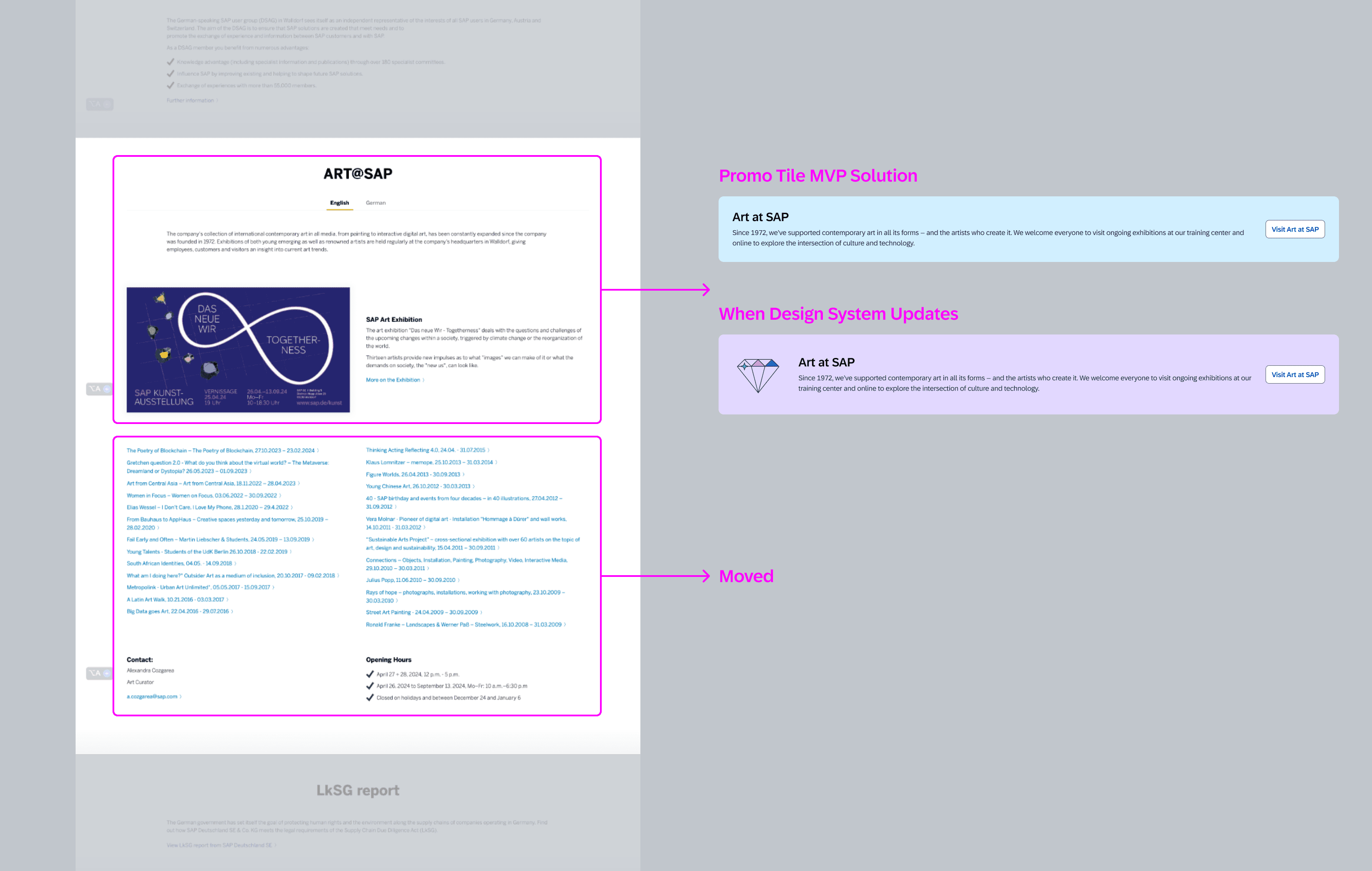
The team decided to launch a pilot site to test and fine-tune the newly developed microsite template. We chose to implement this pilot for a site called Art at SAP. Prior to the microsite pilot, content for Art at SAP was presented on two separate DMC sites. Our goal was to merge these two sites and move them into the Discover node under SAP.com.
Hero combination guidance
Additionally, Art at SAP is featured on the company's About page with numerous PDF links to past exhibitions. When merging the websites, we need to create a dedicated space to accommodate this content as well.
Challenge
Tight timeline
This project was challenging due to its tight timeline - we need to get it ready in just over a month before a major event launch in June.
New process
Navigate through a newly forming team while working with a newly developed framework. Unexpected content quality issue cames up.
SAP visual identity update
Extra effort needed to align with available components in both the short and long term for everything planned to be updated in the near future.
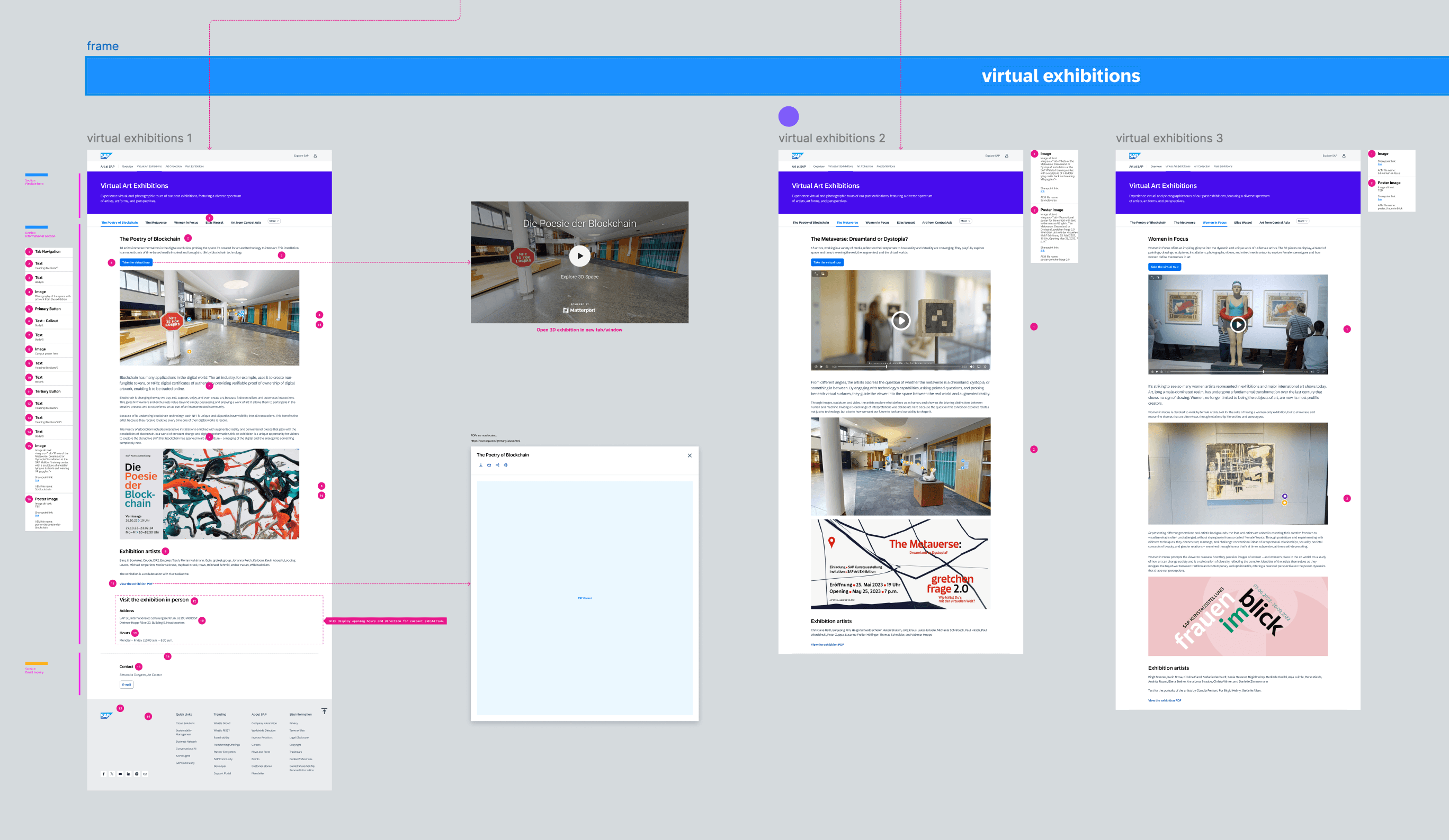
Design, content and component specifications
Successful Launch
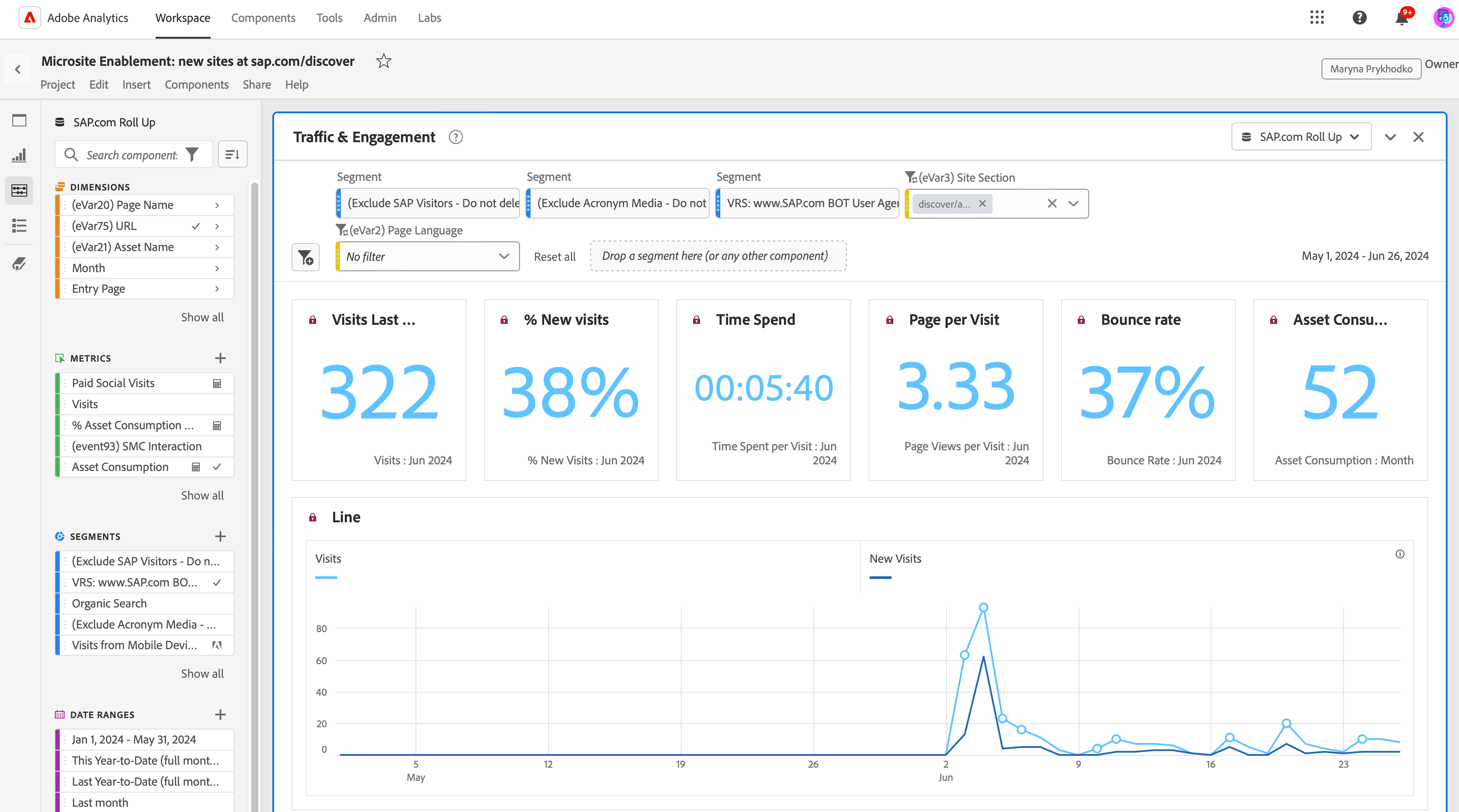
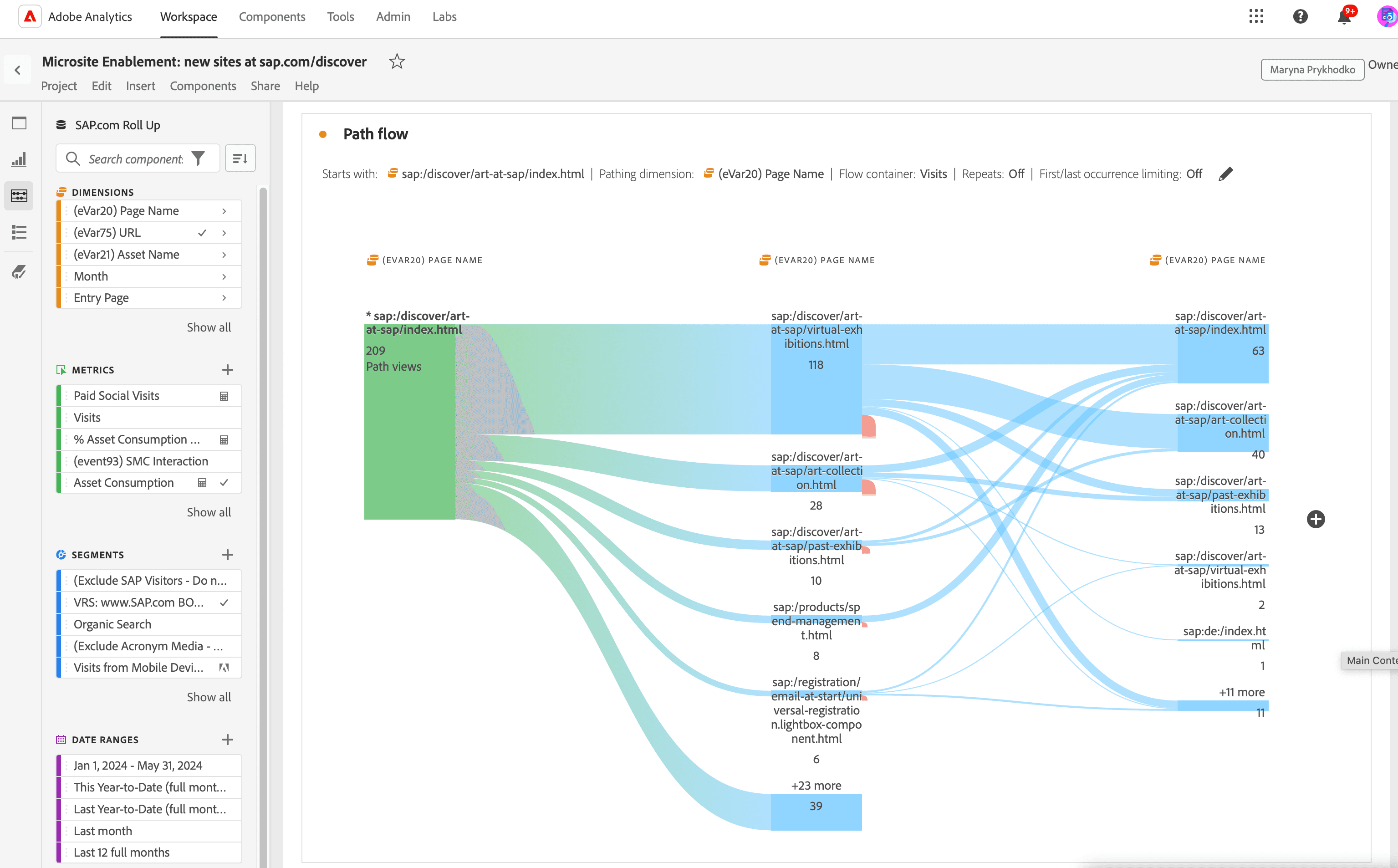
The Art at SAP microsite enhances SAP's brand perception by showcasing support for culture and fostering creativity, innovation, and emotional connections with customers. Completed on schedule, the microsite was launched in June 2024 and is being actively monitored to evaluate performance and ensure objectives and KPIs are being met.
By adopting the microsite template, Art at SAP has already demonstrated significant improvements by unifying content from disparate sites into a cohesive, unified, and more discoverable experience.
