Industry
Healthcare
Company
ION Design x Global Health Labs
AVE App
Mobile App
Aritificial Intelligence
Complex Workflow
Interaction Design
Visual Design
About Automated Visual Evaluation (AVE)
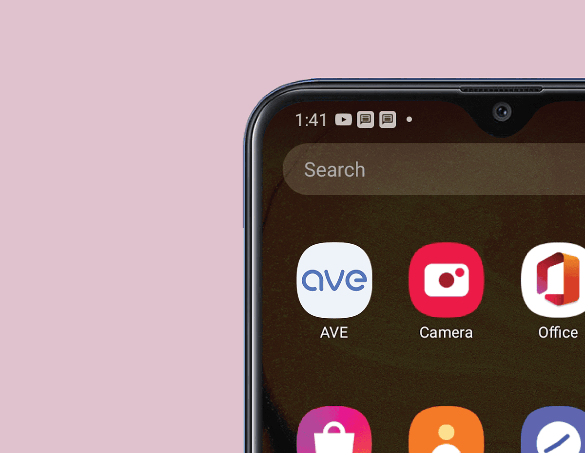
To help bridge gaps of cervical cancer screening in low-and middle-income countries (LMICs), Global Health Labs partnered with ION Design to develop an Automated Visual Evaluation (AVE) smartphone-based app that applies machine learning to detect pre-cancerous lesions.
The integrated software incorporates data entry, image capture and analysis, and data export to auto-capture and interpret a quality in-focus image in less than two minutes, computing the likely presence of pre-cancer/cancer with high accuracy.
My Responsibility
From 2018 to 2019, I collaborated with design leads at ION Design, the product team at Global Health Labs, stakeholders and subject matter experts from multiple countries, created an inclusive, accessible mobile app.
I mapped out complex workflows and wireframes, designed the AVE app logo and established the visual style. I also created interactive prototypes for the mobile app and iterated the designs based on user testing feedback.
Sample Screens
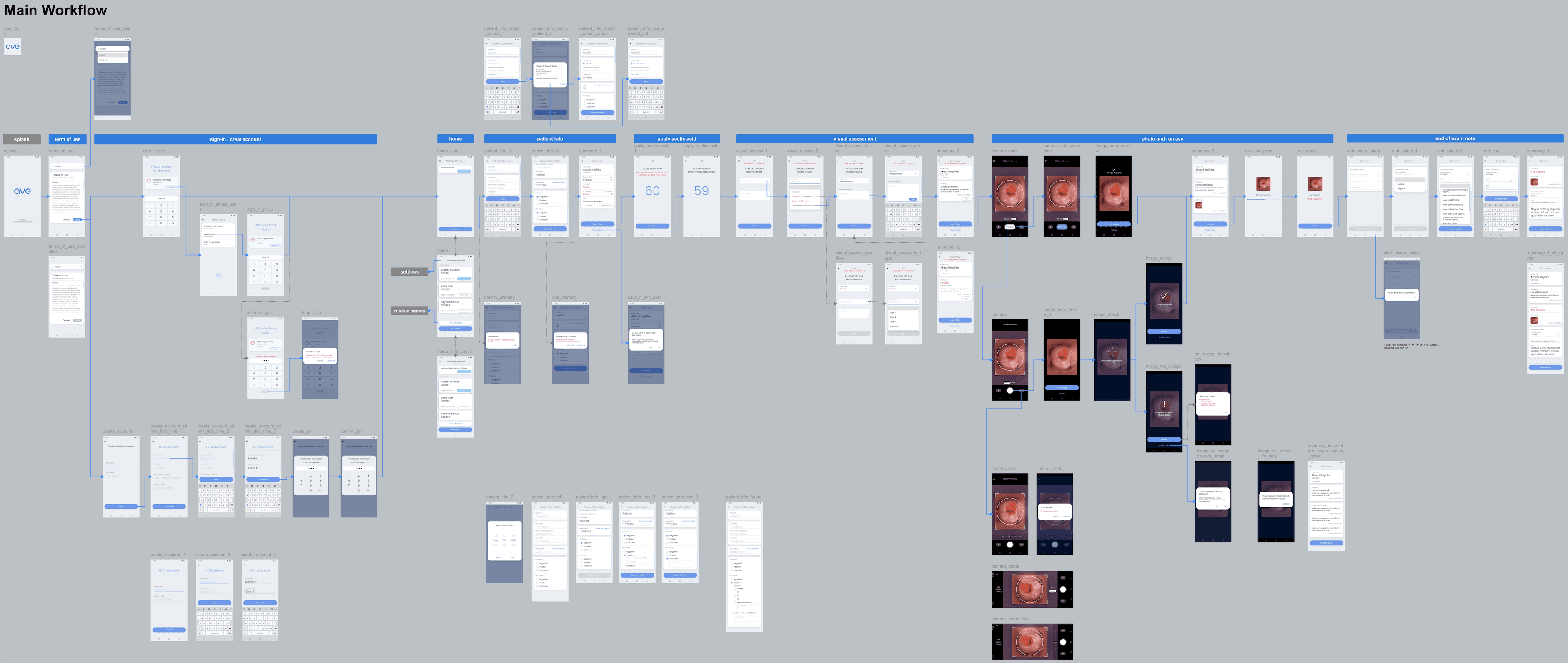
Main workflow
The AVE app required a seamless user experience to support clinicians through various stages of the cervical cancer screening process. The main workflows I designed include:
Sign-in / Creating account
Patient information forms
Apply acetic acid timing
Visual assessment notes
Photo taking and running AVE
End-of-exam notes
AVE app main workflow - clinician visit.
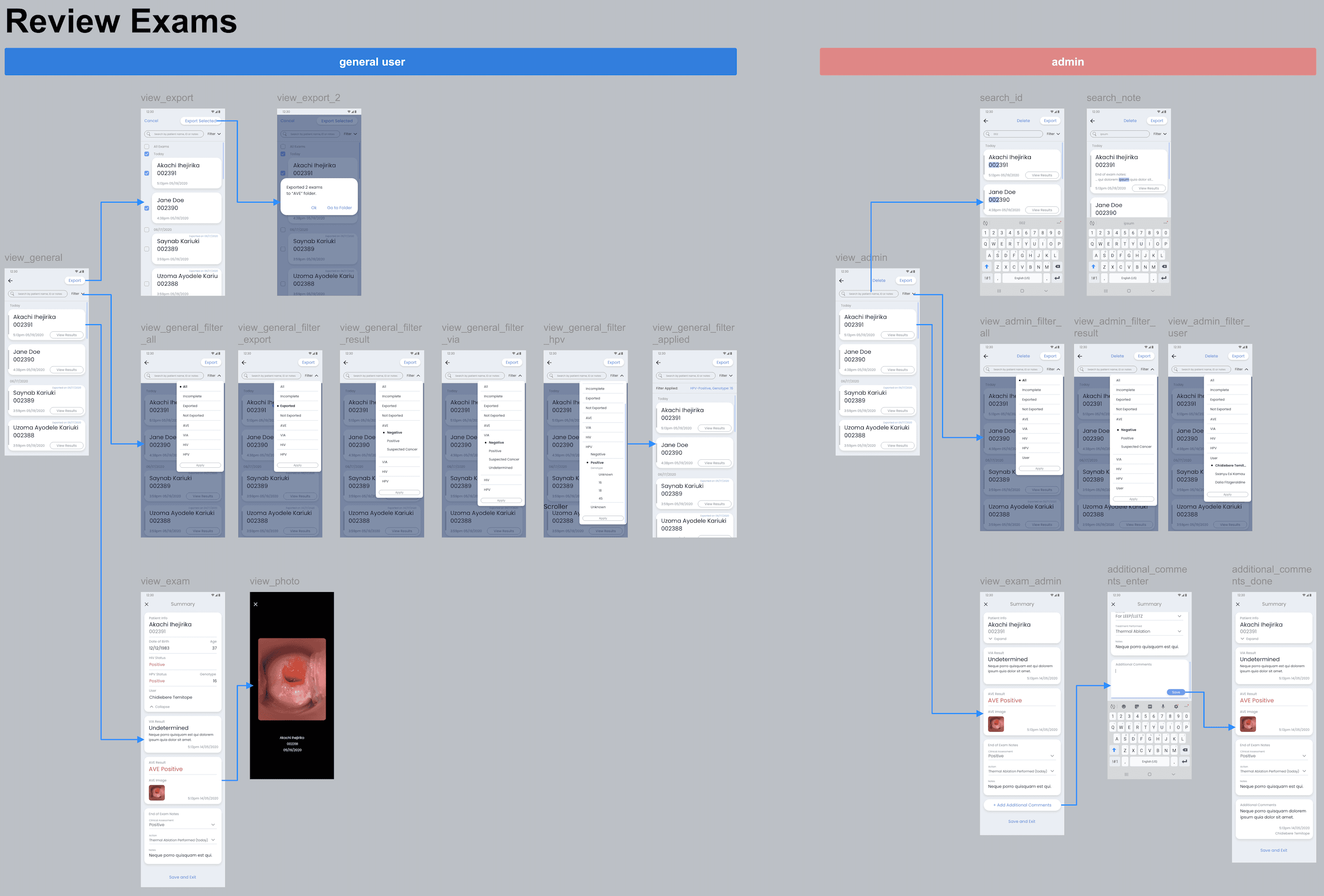
Reviewing exams and settings. Three type of users (general clinic users, admin clinic users and global admins) have different access to different functions of this app.
Patient information documentation screens.
Training Mode
An important feature I designed was the training mode for clinicians. Understanding the complexity of the screening process, I developed an onboarding experience that provided example trials, helping new users familiarize themselves with the app.
Default (left) and training mode (right).
Enter training mode.
It's important to remind users when they are in training mode as all data will not be saved during the training process. So I created a training tag at the top right corner, which shows up when training mode card is hidden during scrolling. The training tag was designed to subtly appear and disappear depending on user interactions, ensuring clarity without overwhelming the user interface.
Training tag micro-interaction.
The AVE app has been successfully delivered, providing clinicians in low-resource settings with a fast and accurate tool to detect pre-cancerous lesions using AI-driven image analysis.
Results from AVE are exported to Data Manager, an app that helps doctors organize and share cancer screening data to support patient care.
Learn more the Data Manager case study here:


